Designing for Device Orientation: Landscape Mode
- Functional analysis
- Contextual enquiry
- Wireframing
- Hi-fi prototyping
Challenge
My client was an online sports betting company that invested heavily in live streaming and needed to better track its value. The core problem: users were not able to access any betting offer or place bets while watching live streamed events in landscape mode on their app.
The client provided user stories based on quantitative research. My job was to understand how streaming platforms handle full-screen usability, then propose ideas to solve existing issues and prevent new ones.
Process
Functional Analysis
I analysed screen interactions to understand the sequence of actions users perform, mapping these against the provided user stories. I studied apps including Facebook, YouTube, Netflix, Instagram Stories, and Bloomberg, gathering interaction patterns that could apply to our project:
- Appearance and disappearance of native navigation
- Swipe interactions
- Pop-ups and collapse patterns
- Search behaviour
- Orientation features
- Opening/closing windows
- Information display
- Use of icons vs. wording
Contextual Enquiry
I knew very little about online betting when I began, so I observed betting platform users and tried betting online myself to understand the process. I observed 8 users to understand existing behaviour when they bet online.
In a nutshell, bettors can be classified as casual or regular. Despite having different purposes and needs, I identified a pattern: the deposit feature was critical, as bettors need to refer to their deposit or request a refund at any time during betting.
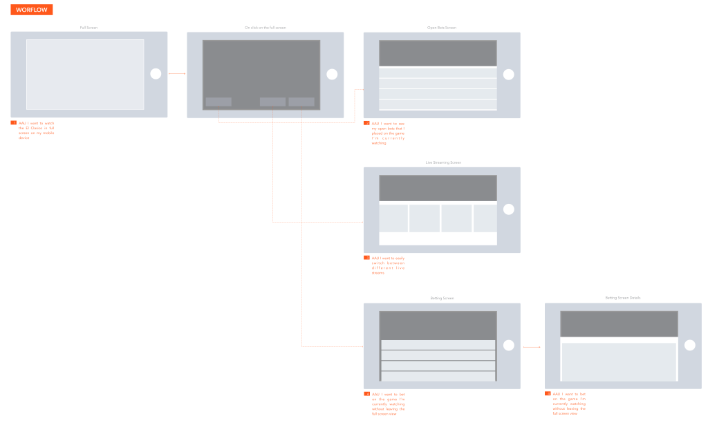
Workflow
The workflow allowed me to get a broader picture of the screens I should produce according to the business requirements, translated into user stories. It mapped every path a user could take while in landscape mode.
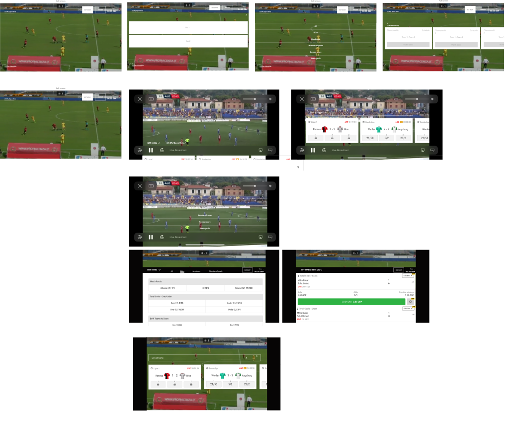
Wireframes
Through wireframes, I established the basic structure of each page before visual design. Iterations were done by user story. Each time I encountered a pain point, I tried to find a new path to go through or to close.
I also added the betting feature, which wasn't in the original requirements. Once I had sufficient observations, I started high-fidelity prototyping.
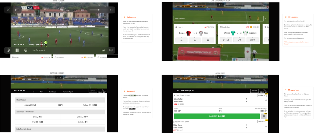
Hi-Fi Prototyping
When I started the hi-fi prototyping, I realised I hadn't accounted for the native elements present on screen in full-screen mode. YouTube, for example, makes smooth transitions between video native elements and custom features.
I decided to focus more on these types of interactions through hi-fi prototyping. I proceeded on the basis that the features already existed on the portrait version, so I used exactly the same design system.
Final Version (with Native Elements)
Outcome
Before this project, I had never thought of landscape mode when designing for mobile. In this case, landscape mode provided an immersive betting experience.
However, some mobile applications automatically set the screen to a particular display orientation and expect users to rotate their device to match.
I discovered that some users have their mobile devices mounted in a fixed orientation (e.g. on the arm of a power wheelchair) and can't rotate their devices. Mobile applications need to support both orientations by making sure the user experience is available in each one.